Checklist: Applying Nielsen’s Heuristics To Fix Data Entry Friction
Before we dive into the technicalities of data pipelines, I want to address a pain point I observe constantly in data teams: the belief that bad data is purely a discipline problem.
I often see Data Analysts struggling with messy datasets—inconsistent naming conventions, empty fields where value is critical, or just plain garbage inputs. The natural reaction is to blame the end-user (the sales rep, the field agent, the operations manager) for not caring enough to enter the data correctly. But in my experience building internal tools, "garbage in" is rarely an act of malice. It is usually a symptom of high friction.
When we treat data entry as a compliance task rather than a user experience challenge, adoption drops. When adoption drops, data integrity collapses.
To solve this upstream, I believe we need to look outside the typical data stack and borrow from the world of UX design. Specifically, Jakob Nielsen’s 10 Usability Heuristics. While originally designed for interface engineering, these principles act as an excellent audit framework for your data collection points (forms, CRMs, ERP inputs).
This checklist is designed to help you audit the source of your data. By fixing the input experience, you reduce the need for heavy-handed ETL cleaning downstream.
The Input Experience Audit Checklist
Run your current data entry forms (whether they are in Salesforce, Airtable, or a custom Typeform) against these criteria.
1. Match Between System and The Real World
Data schemas are often designed for databases, not humans. If your dropdown menu lists cust_type_b2b_v2 but the sales rep thinks in terms of "Enterprise Clients," you are introducing friction.
- The Audit Step: Do field labels speak the user's language or the database's language?
- The Fix: Map user-friendly labels to database values on the backend (using tools like Make or the native form settings) so the user never sees the schema syntax.
2. Error Prevention (Over Error Correction)
Jakob Nielsen argues that a system should prevent errors from occurring in the first place. I frequently see forms that let a user type a full phone number, only to scream at them after they hit "Submit" because they used dashes.
- The Audit Step: Does the form allow invalid input formatting to be typed at all?
- The Fix: Use input masks. If you need a date, force a calendar picker. If you need a phone number, auto-format the digits as they type. If you need a specific status, use a single-select dropdown, never a free-text field.
3. Recognition Rather Than Recall
Cognitive load is the enemy of data accuracy. If a user has to remember a Project ID to log their time, they will likely guess or leave it blank.
- The Audit Step: Are users asked to manually input data that exists elsewhere?
- The Fix: Implement "dynamic lookups." When a user selects a Client, the Project field should automatically filter to show only relevant projects. Do not force them to browse a list of 500 unrelated options.
4. Aesthetic and Minimalist Design (Signal-to-Noise Ratio)
Every extra field on a form decreases the likelihood of accurate completion. The "Just in case" mindset of adding optional fields often leads to form fatigue.
- The Audit Step: Is every field visible on the screen absolutely necessary for this specific context?
- The Fix: Use Conditional Logic (Progressive Disclosure). If a user selects "Other," then show the text box. If they select "Deal Lost," then show the "Reason" dropdown. Keep the initial interface clean.
5. Help Users Recognize and Recover from Errors
Error messages like "Invalid Entry" are useless. They frustrate the user and lead to abandonment or "dummy data" entry just to bypass the block.
- The Audit Step: Do validation errors explain how to fix the problem in plain English?
- The Fix: Custom validation text. Instead of "Error 400," the form should say, "Please use a work email address (ending in @company.com)."
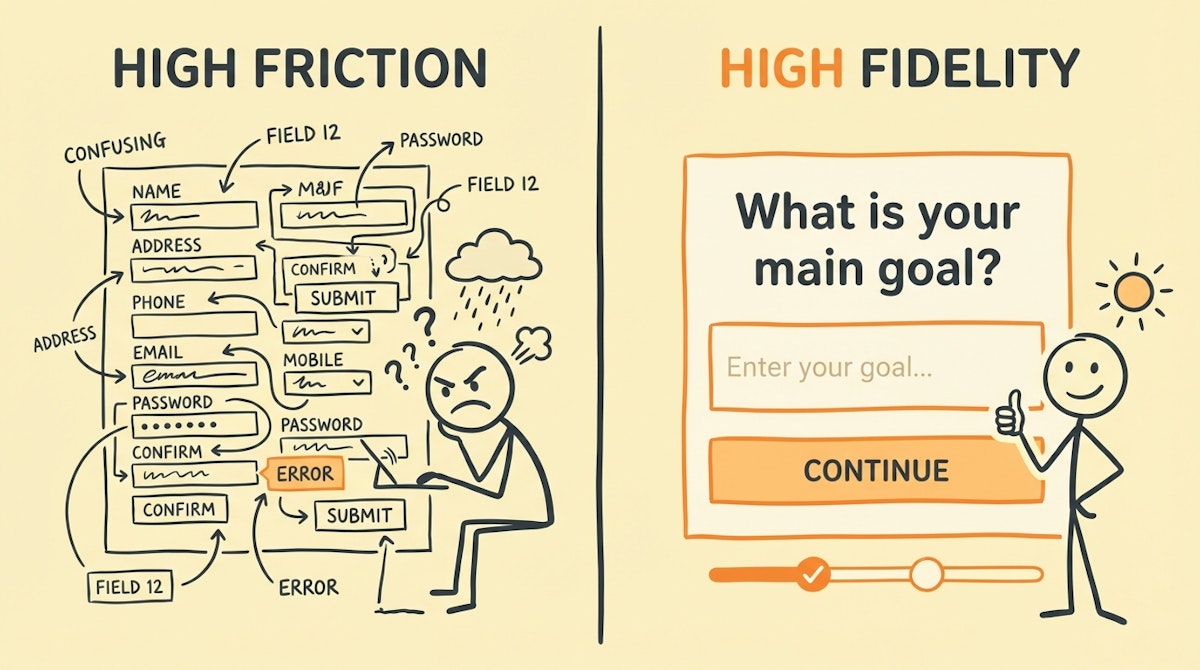
Comparison: Database-Centric vs. Human-Centric Collection
When designing your intake forms—whether via standard SaaS interfaces or custom low-code front ends—the shift in mindset allows for better data hygiene. Here is how the approach differs:
| Design Element | Database-Centric (High Friction) | Human-Centric (High Fidelity) |
|---|---|---|
| Field Logic | Static (Show all fields) | Conditional (Progressive disclosure) |
| Validation | Post-Submission (Blocking) | Real-time (Inline feedback) |
| Nomenclature | Schema Keys (snake_case) | Natural Language |
| Defaults | Null / Empty | Smart Defaults / Pre-filled |
Implementation Strategy
You do not need to be a developer to implement these heuristics. Most modern low-code form builders (JotForm, Typeform, Airtable Interfaces) allow for this level of granularity.
- Map the User Journey: Before building the form, write down what the user is doing right before they need to enter data. Are they on mobile? Are they in a hurry?
- Enforce Constraints via Interface: Stop relying on training documents to tell people how to format data. Use the tool to enforce it.
- Feedback Loops: If you notice a specific field is consistently wrong in your reports, do not just clean it in SQL. Go back to the input form and ask: "Is this question ambiguous?"
Conclusion
Clean data is not just about what happens inside the data warehouse; it is about how humans interact with the collection layer. By reducing the friction required to provide accurate information, you respect the user's time. In return, they provide you with the standardized, high-quality inputs required for robust analytics.
This "people-first" approach to data governance ensures that your automation pipelines are fed by a reliable stream, rather than a polluted trickle.
References
Jakob Nielsen's 10 Usability Heuristics for User Interface Design
Related posts
The Pre-Automation Data Hygiene Process: A Checklist for Error-Free Workflows
Structured Forms vs. Conversational Interfaces: Reducing Friction In Internal Ops
Assembling the Low-Code ETL Toolkit for Independent Data Standardization